Articles
6 Tips to Optimize Your Financial Dashboard for Faster, More Confident Decision-Making
- By AFP Staff
- Published: 5/12/2026

A dashboard is a visual interface that aggregates and displays data in a single, unified view, providing a summary of performance or operational status. Organizations use dashboards to track a variety of financial metrics, including profitability, cash position, foreign exchange rates, variance and valuation.
The key to transforming these metrics into actionable insights lies in the design. Poorly built dashboards require extra interpretation before they can be shared with a wider audience. But if you take the time to clearly present the data, making the story obvious, you can shift the focus to deciding on next steps and the best places to invest time, capital and resources.
Build a tool that drives action by applying these foundational principles shared by Jack Tompkins, Owner of Pineapple Consulting Firm, during the Best of AFP 2025 webinar, “How to Build Dashboards So Good They Eliminate Meetings.”
AI in Finance Certificate

The No Code AI for Finance Certificate program is built for finance professionals who want real, usable AI skills today. Learn to implement AI responsibly, transparently and in a way that strengthens decision-making across your organization.
Learn MoreWhat Makes an Effective Financial Dashboard
By focusing on clarity and user intent, you can create a “self-service” data environment that answers questions before they are even asked. Below are six tips for creating effective financial dashboards.
- Build with a specific purpose in mind. In addition to illustrating the organization’s broader objectives, a dashboard should reflect the priorities of the teams and leaders using it. Otherwise, it risks becoming just a collection of metrics rather than a tool for action.
- Follow a consistent format. This enhances ease of use because the user knows what to expect. The best practice is to put key performance indicators at the top, trends in the middle and supporting details at the bottom.
- Tell the story at a glance. A user should be able to scan a dashboard and grasp the situation almost immediately. To accomplish that, you need to understand the goals of everyone involved: the company, the department and the person who needs the answers (e.g., your boss).
- Keep it simple. The temptation to include more data, more visuals and more complexity is real. We all want to be thorough. But in practice, it usually backfires. Supporting better decisions — not showing off your technical capabilities — is the goal. “The end user just wants the decision-driving impact of the dashboard,” said Tompkins.
- Give context to the numbers. Whether the key metric is cash, profit or something else, users should be able to see how the underlying drivers contribute to the result. It’s important information to have when identifying risks and opportunities.
- Make it dynamic. As the organization’s or team’s priorities shift, dashboards should adapt. “If you're using dashboards correctly, you should be growing,” said Tompkins. “You should be achieving your goals and therefore setting new goals. So if your business is going to be continuously improving and adapting, your dashboard has to be continuously improving and adapting too.”
Dashboard Do's and Don’ts
| Dashboard Do's | Dashboard Don'ts |
|---|---|
| DO: Make the story clear within seconds; the faster the insight, the more useful the dashboard. | DON’T: Get lost in the details; focus on what drives the decision. It’s easy to get lost in the weeds with data that doesn’t matter. |
| DO: Include a way to learn more, such as a second page for a deep dive. | DON’T: Overcomplicate visuals. Too many labels can make people confused as to what they are looking at. |
| DO: Add relevant context, such as comparing to budget, industry average, month over month, or year over year. | DON’T: Use misleading or unclear visuals. For example, certain types of charts, particularly pie charts, can make insights unclear. |
| DO: Let people choose their own timeframe. Dashboards must have dates to have meaning. | DON’T: Distort comparisons. When axes are inconsistent, it can lead to an erroneous conclusion. |
| DO: Answer the question. Ensure the question being answered is clear. | DON’T: Treat dashboards as one-off projects. They should evolve with the business. |
Learn More
Looking to apply these dashboard best practices to your working capital metrics? Join us on July 15 for the AFP Treasury Connect: Working Capital: Strategy and Tactics for Resiliency, which features a session that explores how accessible, well-governed dashboards move working capital conversations from periodic reporting to continuous management.
Copyright © 2026 Association for Financial Professionals, Inc.
All rights reserved.
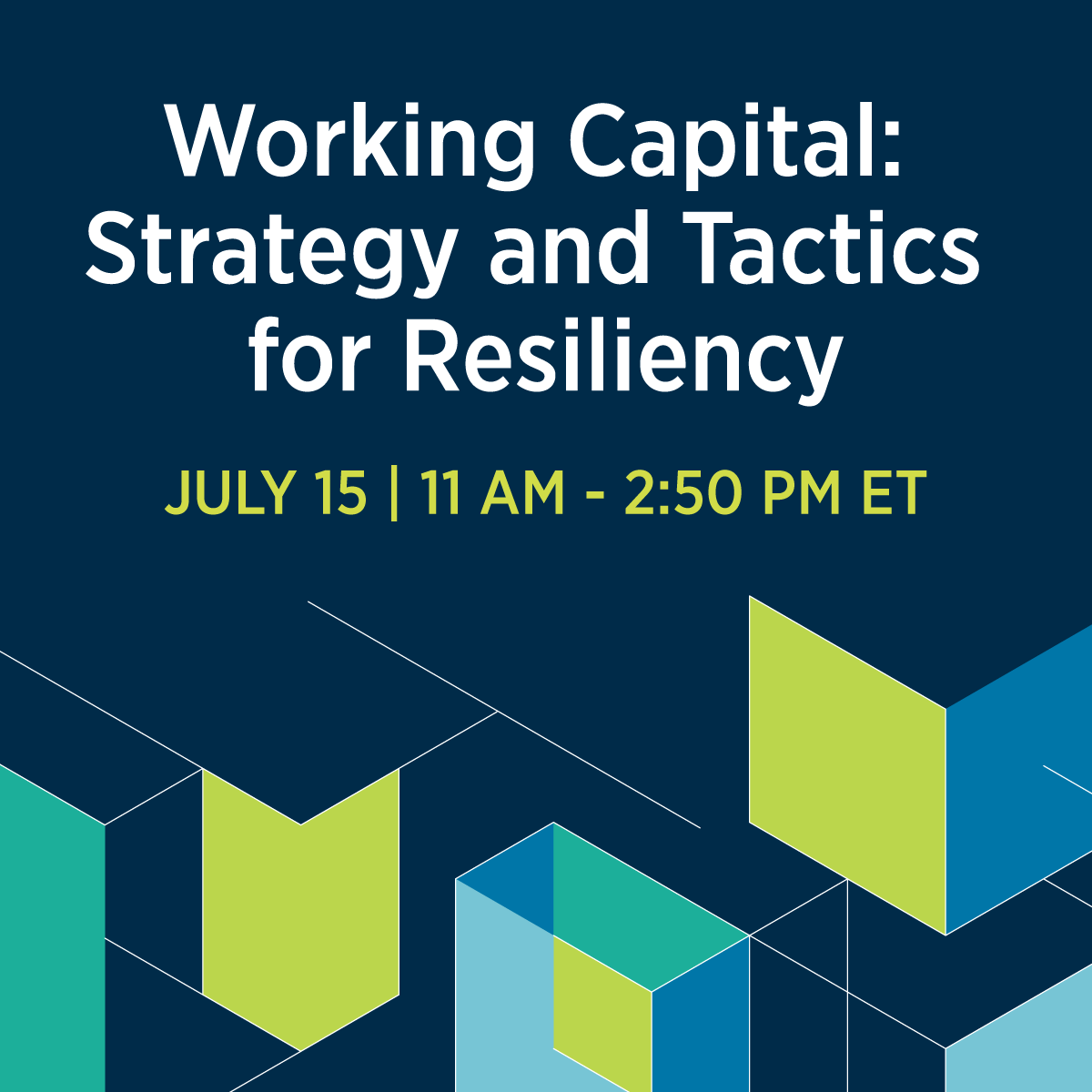
Treasury Connect Virtual Series
Turn working capital into a competitive advantage. Learn how to improve DSO, optimize DPO, and build a working capital dashboard that aligns treasury, FP&A, and operations. Walk away with practical strategies to improve cash flow, increase visibility, and support better business decisions.
AFP Membership
The Hub for Treasury and Finance Professionals
As an AFP member, you'll gain access to exclusive training, certifications, research and networking to advance your career.
AFP Newsletters
Unbiased, practitioner-driven information for treasury and finance professionals
Subscribe to an AFP Newsletter to receive the latest news, events and trends in FP&A, Treasury or career planning.